I love what Google has done.
Search surprised the world (or at least Yahoo!), GMail turned the world of webmail upside-down, Maps effectively launched web2.0, and part of their success has been their spartan yet functional design. I like it, but for a company focused on engineering, the various apps' interfaces (Mail, Voice, Reader, Calendar, for today's example) all differ from each other in noticeable and annoying ways.
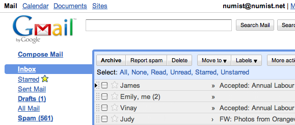
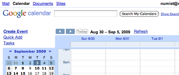
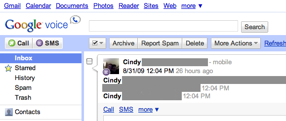
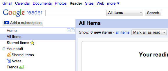
while it still feels like I'm using a Google app, flipping between sites makes them feel sloppy.
it brings to mind the blog post Douglas Bowman made when he quit Google. as a classical designer, it must have been hard to function in such an engineering-oriented company. still, I have to wonder how UI inconsistencies between apps (and within them) can take a back seat to investigating shades of blue.
at the end of the day, Google stores my mail, appointments, phone activity, and feeds. I appreciate the emphasis on a solid infrastructure and wouldn't trade it for better design.